Stop Repeating Yourself! Adopt Object Oriented CSS (OOCSS) for a Faster Web
By Intern |17 Apr 2012

In a bid to make websites faster and more maintainable, the Fresh Egg web design team has learnt to embrace best practice to help keep source code clean and lightweight. In the third post of The Ultimate Web Design Toolkit series, we’ll explore how to write lighter and more maintainable CSS (Cascading Style Sheets) by introducing the concept of Object Oriented CSS.
Way back in the days of formatting website content using inline HTML such as <font> to style textual content or <table> to layout content, websites were hard to maintain and web designers were limited in design capabilities.
CSS was primarily created by the W3C (World Wide Web Consortium) to strip all content formatting out of the front-end source code and store it in a separate file, a CSS file. CSS enables you to style elements such as layout, colours, and fonts. It improves accessibility, gives developers more flexibility in presentation, and enables multiple pages to share formatting.
How can we make CSS better?
Over the years, the way CSS is written has changed considerably. Historically it was used just to style textual content, and then to style the entire layout of a web page. However, this often meant writing thousands of lines of code, which adversely affected site performance and maintainability.
Then came OOCSS (Object Oriented CSS). OOCSS is a framework created by Nicole Sullivan that encourages developers to write CSS that is lightweight, maintainable and easy to reuse.
There two main principles to keep in mind when attempting to write OOCSS:
1. Separate structure from skin
Every website has repeatable visual elements that could share the same colour, shape or size. You might have elements such as links or panels that contain textual content, which share consistent border styles or background colours but vary in padding and width. For example:
.panel {
background: #333;
border: 2px solid #666;
color: #fff;
padding: 15px;
width: 200px;
}
.link {
background: #333;
border: 2px solid #666;
color: #fff;
padding: 5px 10px;
width: 100px;
}
As you can see, there are duplicated styles, within the code. Through the use of OOCSS, the code can be reworked to create a global skin class alongside the shared properties. This also has the added benefit of creating reusable elements. For example:
. panel {
padding: 15px;
width: 200px;
}
. link {
padding: 5px 10px;
width: 100px;
}
.skin {
background: #333;
border: 2px solid #666;
color: #fff;
}
Easy ah? By doing it this way, you make CSS reusable, maintainable and lightweight.
This is how the HTML should look:
<section>content</section>
<a href="">text</a>
2. Separate containers from content
Making your CSS location dependent is not good practice. The styles become too specific to a location, which makes it harder to maintain, and encourages you to constantly overwrite the styles. For example:
.body p{
color: #f60;
font-family: Georgia, 'Times New Roman', Times, serif;
font-size: 14px;
line-height: 20px;
}
.footer p{
color: #f60;
font-family: Georgia, 'Times New Roman', Times, serif;
font-size: 12px;
line-height: 16px;
}
By styling the <p> tags specific to a location you are causing unnecessary duplication. Instead, create and apply a class that describes the <p> in question, like <p>. The benefits of doing this are:
- All un-classed <p>s will look the same;
- All elements with the small-text class will look the same;
- You won’t need to create an override style for when you actually do want .footer p to look like the normal <p>.
The Media Object
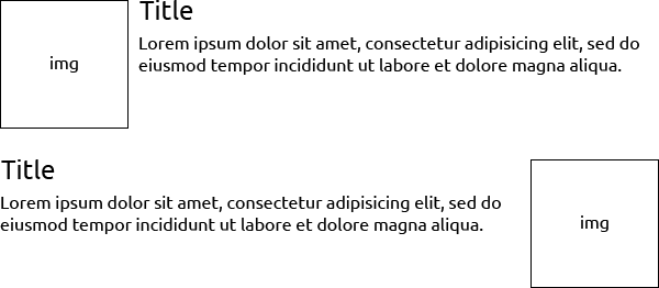
Created by Nicole Sullivan, the media object is a reusable module that will save writing lots of code because you don’t repeat yourself. Here’s an example:
HTML:
<article>
<a href="http://www.freshegg.com">
<img src="http://www.freshegg.com/image.jpg" alt="text">
</a>
<div>
<h2>Title</h2>
<p>Lorem ipsum dolor sit amet, consectetur adipisicing elit, sed do eiusmod tempor incididunt ut labore et dolore magna aliqua.</p>
</div>
</article>
CSS:
.media {margin:10px;}
.media, .bd {overflow:hidden; _overflow:visible; zoom:1;}
.media .img {float:left; margin-right: 10px;}
.media .imgExt {float:right; margin-left: 10px;}
.media .img img {display:block;}
- Firstly, clearfix the wrapper and inner content using the overflow property;
- Set the img to float left or right (use .imgExt to float right);
- Set the margin or padding to space out the image from the content.
It’s simple, can be nested, and is reusable. Here’s how it will look:

Some tips to get started
- Implement alongside CSS grids;
- Don’t use location specific selectors i.e. .footer p;
- Don’t attach classes to tags i.e. p.small-text;
- Check your CSS using tools such as CSS Lint;
- Plan for OOCSS - it’s good to plan how to use this framework right from the word go. The design team at Fresh Egg use a style guide that is rolled out at the start of the site build to figure out which styles could be reused and made into modules. Once that’s done, it’s just a case of laying out all text, fonts, buttons, colours, borders, widths, and boxes onto a canvas to visualise the elements.
- Give it a try; you’ll find it saves you time maintaining your site and makes your CSS lighter.