Google Removes Underline From SERP’s
By Intern |1 Jul 2010
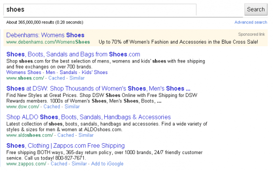
Has anyone else seen Google's latest update to their results pages? Have a look at the screenshot below:

They've removed the underline from each returned result; the change doesn't appear to have come into place across all browsers yet though. I just did a quick search on Mozilla Firefox and the underline remains, whereas a search on Google Chrome reveals the latest update to the SERP.
The underline hasn't been removed altogether though, it now appears when you hover over one of the links. What I'm wondering is 'what exactly is the point of this?'. It doesn't really make the page look notably different, and doesn't offer any real improvement in usability. I suppose you could tenuously argue that it makes it clearer to users that the each returned result is a clickable link, but to be honest if you didn't know that already I doubt you'd have done a Google search in the first place.
Seems to me like a slight waste of time to be honest, if they wanted to improve usability they could have added numbered results as a standard, saving all us SEO's the trouble of downloading plugins. Or they could take a leaf from Yandex (who DO provide numbered results) and display favicons next to the returned results (when available). You might think Google aren't going to just steal an idea from a potential future rival, but it wouldn't be the first time. Earlier this year Google added a function that allowed you to add your own background image to the Google homepage, a feature taken directly from the Bing playbook. It didn't last anyway, after numerous complaints Google removed the feature and went back to the minimal design approach that made it so memorable and popular in the first place.
I'm not really sure what Google are up to, they've got enough on their plate without spending their time tinkering with essentially irrelevant aesthetic changes. Nobody's going to move over to Google from a previously preferred search engine, because 'Google doesn't have underlined results'. If I was head of the Google team, I'd want them focusing more on the Facebook issue, and dealing with the myriad of rumours concerning Google Me.
What do you think of the new results page? Do you like the look of it? Think it's pointless? Leave a comment and let me know what you think