Why is Site Structure So Important for SEO and UX?
By Intern |24 Nov 2015
Site structure plays an imperative role for both SEO and usability. It’s the core of your website – which impacts how it is crawled, how it is seen and indexed by search engines and how the user can navigate their onsite journey. That’s why getting it right is absolutely crucial.
A good way to look at improving your site structure is to first of all understand your customer base. If your webpages are grouped together logically using common folders, it will make it easier for visitors to move around your site.
Begin by asking yourself the following questions:
-
What are your customers searching for? (search intent)
-
What steps would they expect to take to purchase a product or obtain information from your site?
-
Can a visitor to your site actually find what they are looking for, or is your site disorganised and made up of jumbled pages?
Here’s why a streamlined site structure is essential for SEO performance and user experience:
Improving your site’s crawlability
An excellent site structure will make it easier for spiders (such as Googlebot) to crawl your site and discover your content. Since search engines rely on navigation structure to help determine the hierarchy and importance of pages on the site, you should ensure your pages are easily accessible within your site’s architecture. Specifically, pages deeper within the website structure will generally take longer for search engines to crawl, particularly for larger websites, which could see deeper pages crawled less frequently or not at all.
Developing a better internal link structure
A well-executed site structure allows for a good internal linking structure. Most importantly, this helps website crawlers understand the relationship between each page.
An effective site will group related pages together, and use key terms where appropriate. This is often known as siloing. Relevant internal links can then be placed strategically on each related page – signalling the relationship between each product or category page.
Prioritising your pages using site hierarchy
The URL structure of a website should be clear for both the visitor and search engine crawlers. Reason being, URLs are displayed within the SERPs and can be seen as an influential factor for click-through rates.
A well-integrated site structure will use consistent URLs that reflect the hierarchy of the site. Short but descriptive URLs are recommended for search optimisation, with essential keywords placed towards the front of the URL structure, to introduce a clear hierarchy.
As an example let’s say you have an ecommerce fashion site and your products are broken down into four key target markets – Women, Men, Boys and Girls.
This site would require the following URL template:
-
www.myclothingbrand.com/womens/
-
www.myclothingbrand.com/mens/
-
www.myclothingbrand.com/boys/
-
www.myclothingbrand.com/girls/
Inner product pages on this site would look like: www.myclothingbrand.com/mens/jackets/ - as opposed to www.myclothingbrand.com/mens-jackets/. By having a URL structure that uses separate folders for inner product pages, you are able to indicate to both search engines and users on the site that men’s jackets are found on the www.myclothingbrand.com/mens/ section of the site. This would allow the user to easily jump back to the previous section of the site.
Creating breadcrumbs to support your website navigation
Have a complex site structure? Breadcrumbs are useful links which, when implemented correctly, support website navigation. In particular, for search engines they provide a quick path as to where your pages sit within your site’s hierarchy.
Avoiding duplicated pages
Evaluating your current site structure allows you to pinpoint any duplicate content or near-duplicate content.
You may want to consider using free tools, such as Copyscape– this will search for matching content for any given URL.

Figure 1 - Copyscape: free duplicate content checker
Reducing your bounce rate
Bounce rates are typically used to gain an understanding of the level of engagement a user has with your site. Higher bounce rates often indicate a problem with the structure of a site and/or the content on the page. This could simply come down to meaning a user cannot find what they need on your site so they leave your site.
Many studies have highlighted the correlation between bounce rates and visibility in the SERPs. Therefore this is an important SEO metric to review and monitor.
Influencing your brand’s sitelinks
Sitelinks are an additional factor to consider when it comes to site structure and what is displayed in branded SERPs. Site links are automatically generated by Google and help users navigate your site.
It is worth noting that as a site owner you can only demote your sitelinks. Therefore it is imperative to create a well-structured site as you will not be able to manually replace sitelinks displayed in the SERPs.
Here is an example for Myer.com.au – sitelinks for three product categories, as well as sale items have been allocated as the top sitelinks.

Figure 2 - Sitelinks for Myer.com.au
Supporting the conversion funnel
Ever wondered how you can make it easier for website visitors to convert into customers? If a user lands on your site there’s a good chance they might be looking for one of the following: more information, a quote, or their intent may be purely transactional.
Regardless of the searcher’s intent, a navigable site ensures the end goal is easier, by reducing the number of steps involved to complete the action. Therefore it is vital that you organise your site in a way that enables a user to convert within just one or two clicks.
TIP:
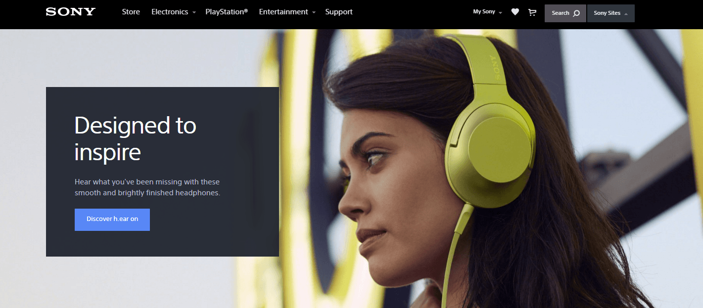
Try using directional cues to guide visitors on your site to a conversion point. Directional cues are anything that helps direct a user to a specific element on the page. As an example, the image of the woman featured on the Sony.com.au homepage is used as a directional cue, pointing towards to the call to action, ‘Discover h.ear on.’

Figure 3 Sony website – example of directional cues
So how do you make your site structure better?
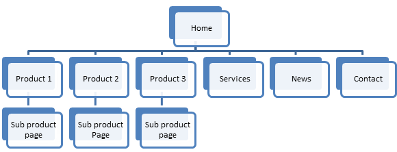
An easy way to kick start your site structure analysis is to visualise all of the pages on your site, using a simple flow chart.
In the below example Fresh Egg have used Microsoft Word’s SmartArt Hierarchy Graphic. This can provide you with an overall view of the site. Once you’re finished reviewing the current depth of your site you’ll be able to identify opportunities to improve and organise your existing site structure.

Figure 4 - Site hierarchy flow chart
So you’ve tidied up your site structure, now what?
If you have moved pages on your site and revised your current URL structure, ensure you implement 301 redirects. You want to make sure that the value is passed through to the current page.
Further to the above, your XML sitemap would require the following:
-
Removing non-200 pages from the XML sitemap and replacing with the current URLs
-
Testing the sitemap within Google Search Console
-
Resubmitting your XML sitemap to Search Console
Now that you know how your site structure can impact your SEO performance and usability, why not set aside some time to review your site?
If you’d like to chat to one of our SEO technicians about your site structure, please get in touch with us today.