Uniqlo's New Website Design: A Surprising Miss for Accessibility

By Lee Colbran|17 Sept 2024
As reported on Econsultancy, Uniqlo, the famous Japanese clothing retailer, recently unveiled a website redesign that has stunned many in the web design and development community—and not in a good way.
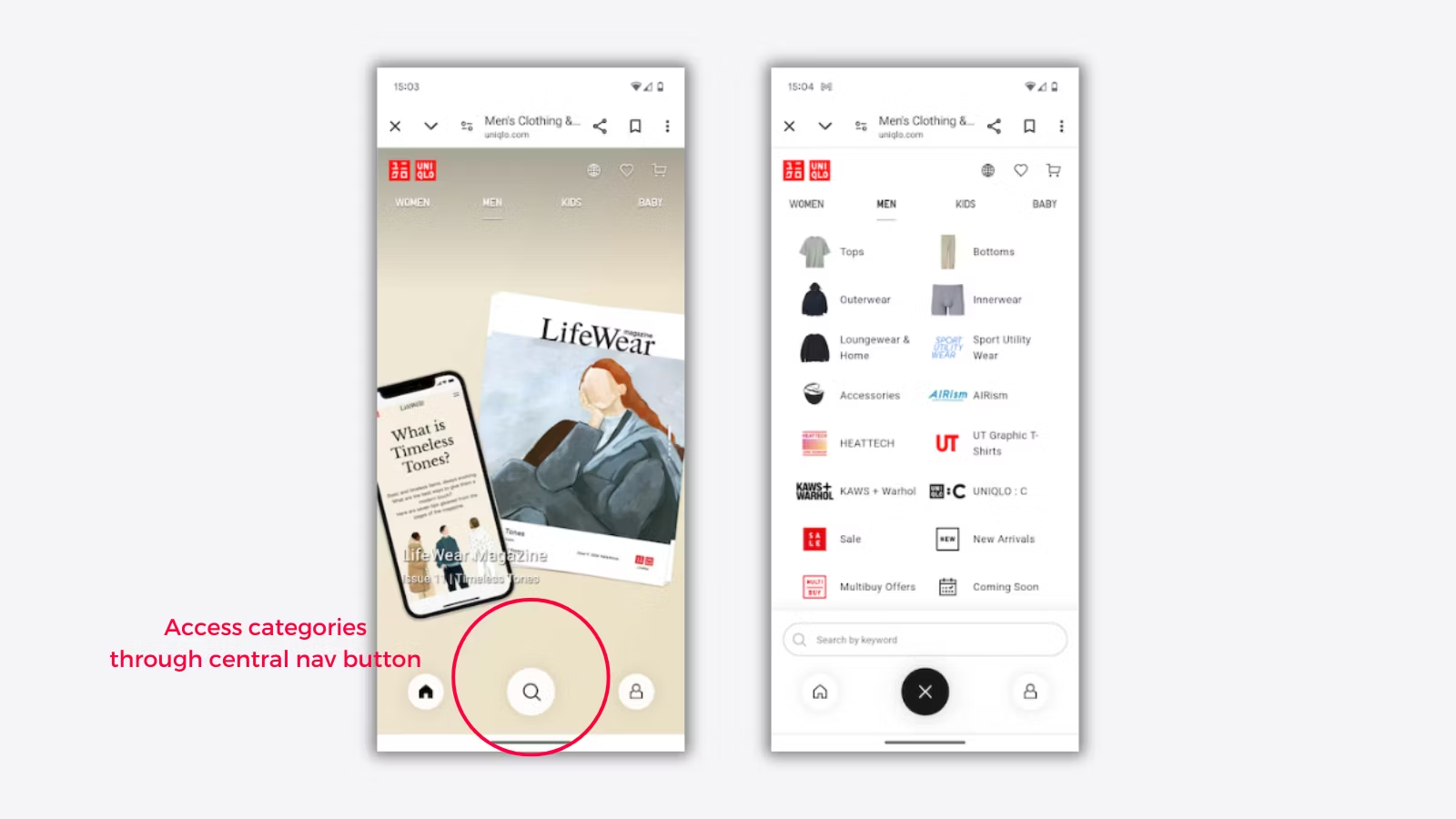
While the recently launched minimalist aesthetic may appeal to many, it comes at a steep cost to accessibility and usability. As an e-commerce giant, the issues surrounding web accessibility best practices are surprising.

Uniqlo's accessibility issues. Image courtesy of Econsultancy.com and Uniqlo.com
While we applaud Uniqlos' design team for pushing the envelope to create something new and conversation-worthy, it does feel like some essential corners have been cut. At Fresh Egg, we always strive to find the line between championing a brand's visual identity while always adhering to UX and Accessibility best practices. It's also worth mentioning that Uniqlo has adopted a unified design approach across this new site and their native mobile application. While there will be savings and efficiencies by using a single design system and UX patterns, we believe this is a perfect example of how this doesn't always work and that specific digital touchpoints need careful consideration.
Stephen Carpenter, Head of Design
The Importance of Web Accessibility
Before diving into the specific issues with Uniqlo's redesign, it's worth emphasising why web accessibility matters. Web accessibility ensures everyone, including people with disabilities, can use websites and web applications. The discipline encompasses various considerations, from visual and motor disabilities to cognitive challenges. Accessible design isn't just a nice-to-have—in many regions, it's a legal requirement. More importantly, it's a moral imperative. The web should be for everyone, and excluding users with disabilities means cutting off a significant portion of potential customers. For a global brand like Uniqlo, this oversight seems particularly egregious.

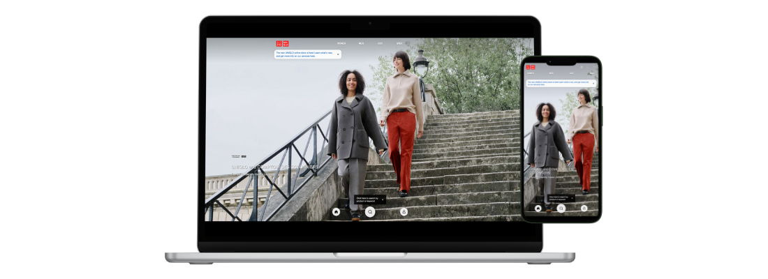
Uniqlo's bold new full screen design looks fantastic, but accessibility concerns exist.
The Accessibility Failures
Let's examine three key areas where Uniqlo's new design falls short of accessibility standards:
1. Lack of Visual Hierarchy and Navigation
p>The homepage presents users with an overwhelming grid of product images that need clear structure and navigation. One of the redesign's most glaring issues is the need for visual hierarchy; this issue poses several accessibility problems, including:
- Screen reader users will struggle to understand the page layout and find important content. Just try it for yourself. We use a free accessibility auditing tool called Silktide (it has a brilliant browser plugin) to give us information about site accessibility issues. Within Silktide, you can use a screen reader. Just try adding anything to the basket on the new site. Good luck!
- Users with cognitive disabilities may find it challenging to process the information overload.
- Keyboard users will have to tab through countless images before reaching meaningful content.
What's the fix?
The implementation of a clear navigation structure, using proper heading tags to create a logical content hierarchy, and providing skip links for users to jump to main content areas.
2. Poor Colour Contrast and Readability
The new design relies heavily on white text on photographic backgrounds. This low-contrast colour contrast severely impacts readability, especially for users with visual impairments or colour blindness. The WCAG guidelines recommend a minimum contrast ratio of 4.5:1 for standard text, which this design needs to meet. Additionally, using all-caps text in a few key areas further reduces readability. For users with dyslexia or other cognitive disabilities, this can be particularly challenging.
What's the fix?
To address these issues, Uniqlo should:
- Increase the colour contrast, especially for text elements.
- Use a mix of upper and lowercase letters for improved readability.
- Ensure font sizes are large enough to be easily legible.
3. Lack of Alternative Text for Images
In a design that relies so heavily on product imagery, the absence of proper, descriptive alternative text (alt text) for images is a critical failure. Alt text is essential for users who rely on screen readers, as it provides a textual description of image content. Without it, these users miss out on crucial product information. Implementing descriptive alt text for all product images should be a top priority for Uniqlo. Doing so would not only improve accessibility but could also boost SEO performance.
What's the fix?
It may seem obvious, but ensure all images have relevant associated Alt text added asap.
The Implications
What makes these accessibility failures look so severe, given that they come from a major global brand in 2024?
Web accessibility standards have been well-established for years, and the importance of inclusive design is widely recognised in the industry. Launching a website that ignores these standards sends a troubling message. It suggests there was an oversight on the importance of accessibility or, worse, doesn't care about providing an equitable experience for all users.
The potential impact on users with disabilities is significant. Many may be unable to browse products, make purchases, or even navigate the site. This oversight not only results in potential lost sales for the brand but also perpetuates the digital divide that accessibility advocates have long fought against.
Conclusion
In conclusion, the website redesign reminds us that accessibility must be a fundamental consideration in web design and development, not an afterthought. As the web continues to play an increasingly central role in our lives, we must demand better from major brands. Accessibility is not optional—it's essential for creating a genuinely inclusive digital world.
Do you have a design project we can help you with? Our team provides expert design consultancy for businesses wanting to enhance and optimise site performance. Contact us for information on how we can help.
