User centred design trends for 2020: What not to miss this year

By Nathan Kingstone|9 Jan 2020
How user centred is your website or product design? To be truly desirable and meaningful, you need to make sure your website and product embodies the needs of your end users.
At each stage of your design process, from discovery through to post-launch, give your users’ wants and limitations proper attention. In short, you need to put your customers at the heart of the online experience.
Concepts like personalisation, minimalism and accessibility are the key tenets of UCD; it is less about wowing your users and more about making products they simply love to use.
Learn how to put users at the heart of your UX strategy in our 30-page guide to user centred design
In this blog post, we reveal the seven design trends that will matter for businesses like yours in 2020, and how to adopt them when creating your products and services.
1. Personalisation
It’s no secret that users demand increasingly personalised experiences. In 2020, companies serving customers relevant content and recommending services that cater to them will be the most competitive.
To personalise your brand’s user experience, use the data you have on your audience to solve their personal needs. You could introduce product recommendations, shopping cart abandonment emails, newsletter sign-up modals that are triggered after a certain time or series of actions, recently viewed items and more.
Our white paper on essential personalisations reveals how you can overcome the most common blockers experienced by marketers in delivering against personalisation strategies and gives you a set of personalisation fundamentals that should be part of any marketing plan.
2. Material design
Material design is a design language that was developed by Google in 2014. It adopts a grid-based approach, animated logos, motion graphics, 3D icons and custom colour palettes.
This year, Material design is set to make user experience even more engaging, with intricate patterns, textures, customisation options and advanced interactivity.
The principles of Material design include keeping the UI consistent across different platforms, providing meaning with motion and being guided by print design methods for typography, grids, space, colour and imagery to immerse users in the experience.
Adopt Material design principles by nailing down the look and feel of your website and unifying the user experience across entire websites and on different devices. You could also take inspiration from other design systems created by well-known online brands.

3. Designing for content
The Holy Grail of UX design is a content-first, design-second approach. Why? Because your copy and visuals help shape the design and user journeys.
Designing ‘blind’, without any idea of the messaging and character counts will make for results that don’t effectively guide users and help them achieve their goals.
To keep up with the very best UX examples on the web, you should aim to at least use ‘proto-content’, which is as close to the finalised content as possible, to inform the design of your website or product in the earliest stages.
It will help your designers create a meaningful and functional interface, with a clear flow, a customised look and feel and an end product that matches your tone of voice with design elements.
4. Animation and micro-interactions
Incorporating animation and micro-interactions in websites and UX design has been trendy for a few years now, but we expect these to get even cleverer and more sophisticated this year.
Motion and small delightful moments get users’ attention and make interfaces more memorable and enjoyable. They give users feedback about what they are doing on a website, for example clicking a button or completing a form.
Consider adding animations and micro-interactions to your website and user journey where it makes sense. You can test their success by comparing versions without motion.
Animations can be used for buttons, icons, charts and more. Micro-interactions can include animations, but can also be used in data input, swiping and more. Best practice is to keep them simple, visually engaging and effortless. Here are some visual examples of micro-interactions.

5. Accessible design
Accessible design means building digital products and platforms that can be used by a wide range of people, including individuals with visual, motor, auditory, speech, or cognitive disabilities.
Organisations are growing more and more aware that inclusive design that is accessible to all is essential to provide exemplary user experience for all users.
More websites will be designed with accessibility built-in from the beginning, including considerations around font sizes, colour contrasts, intuitive navigation, video captions, clearer instructions and invitations for users to provide feedback.
Make sure you think about accessibility early in your design process, so that inclusivity and convenience is part of your product or website’s DNA. Consider the use of animations and micro-interactions when thinking about how accessible your website design is.
6. AI for testing design options and making decisions
Artificial intelligence is a bit of a buzz-term at the moment, with robots and humanoids being developed to simulate us.
But AI can also complement user centred design, with computers and programmes designing and testing iterations against parameters that we define.
Computational design has the potential to make designing websites, running tests and making decisions quicker, easier and cheaper, so that we can consider different and bigger design issues.
AI is also powerful enough to analyse large amounts of data from your website and suggest design adjustments, creating new designs to test against other versions in A/B tests.
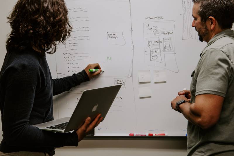
Airbnb uses machine learning to generate design-ready code for prototypes from whiteboard drawings, which it can then test and learn from.

7. Data and design collaboration
Data-driven design makes sense; the most forward-thinking companies use data to inform their designs, with the two disciplines working inseparably.
In 2020, designers and developers will work increasingly collaboratively, with data insights directing design through user research, user testing, and analytics and reporting.
The result will be cross-functional teams, sharing knowledge, skills and workflows. Because of this deeper integration of data and design, websites and products will be more centred around users’ needs.
Keep learning with Fresh Egg
Join our email list like thousands of other marketing professionals to get updates on key industry changes, early access to free resources and exclusive invitations to Fresh Egg events in your inbox.