How to Increase Online Charity Donations
Is your charity chasing big fundraising targets? Then you need your website to work harder to bring in the donations. Here's our detailed guide to improving the online donation journey, complete with examples.

Charities always need effective ways to increase donations. One simple and highly cost-effective approach is to think of your website as a donation engine. Are all the elements of your online donation process working as well as they could? What could be added? What could be eliminated? What could be redesigned?
We know from our experience with NFP organisations that charities tend to lag behind other sectors when it comes to taking advantage of the insights and online fixes thrown up by user-centred design. That’s why we’ve put our heads together and created this guide to optimising your online donation journey. Our donation funnel guide has four steps. Follow our process and reap the rewards for your organisation – in the form of existing donation uplift as well as the creation of a new wave of regular and one-off donors. Or else talk to us.
Our four-step guide

1. Know your donors
Team members: user researcher & data analyst & project manager
Identify donor needs
The Pareto principle tells us that 80% of a charity’s donations come from 20% of its lead donors. However, every lead donor starts as a first-time donor and must be nurtured along the way. Donors have different needs according to their level of engagement with your charity. What are these needs, exactly?
The first step of an online donation optimisation process is identifying user needs. We recommend performing an ‘empathy-mapping’ workshop with charity stakeholders or conducting one-on-one interviews and tests with donors. This will enable you to understand user attitudes and behaviours, what users expect from the charity and what motivates them to donate.
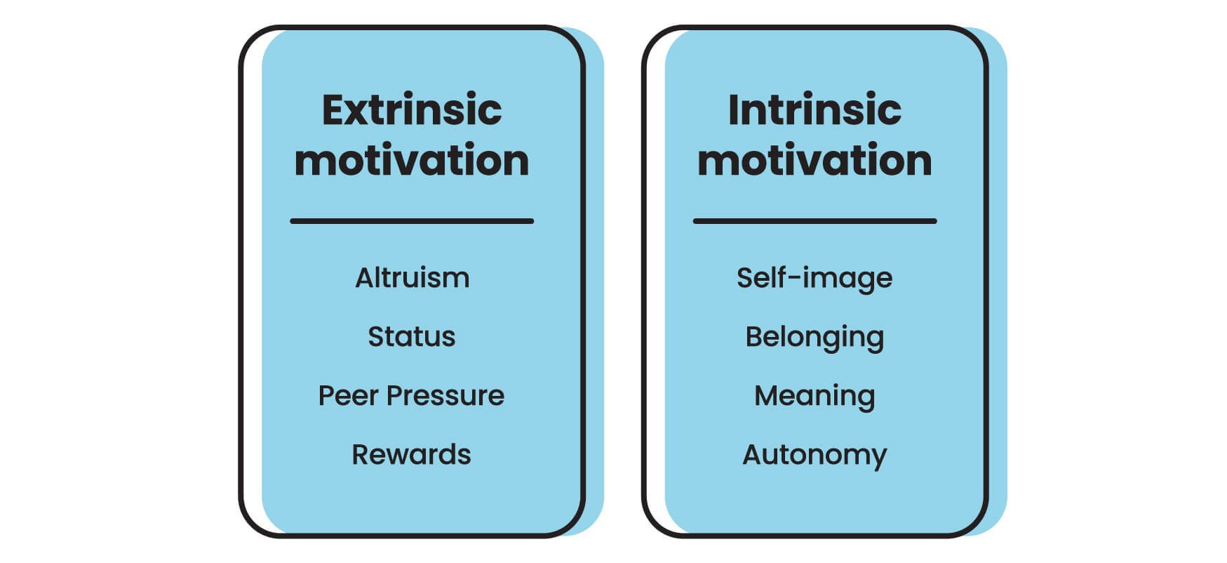
Typically, altruistic donors are motivated by reaching a fundraising target or achieving a beneficial outcome. And then there is the majority of donors, whose altruism comes with mixed motives because they want to feel good about themselves.
Donor journey modelling
When combined with website data analysis, the results of user research inform the mapping of typical user journeys on the path to donation. Building donor experience maps across a charity’s touchpoints identify the online ‘moments of truth’ which have a high impact on donor behaviour.
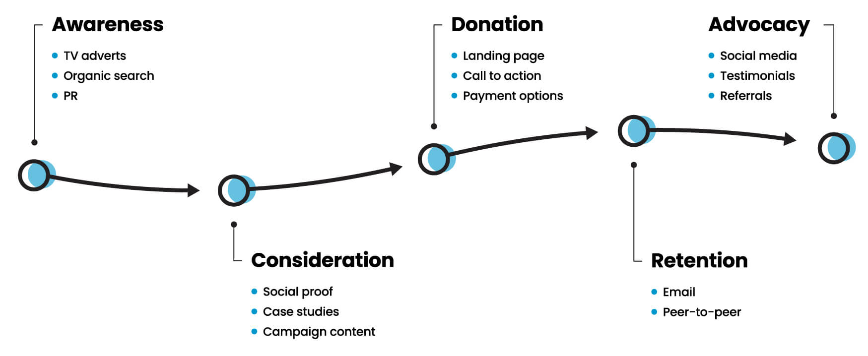
Example
2. Set your strategy
Team members: strategist & project manager
Donation goals
The second step of an online donation optimisation process is identifying the donation goals. Are you driving donations with campaigns or events? How do you plan to stimulate ongoing donation support? Aligning your fundraising strategy with users' needs will help ease the path to donation.
Campaign appeals must have a clear purpose (check the Charity Commission guidance). It's a legal requirement that you use the donations you receive only for the purpose outlined in your appeal.
As a result, you might want to have more than one campaign appeal running live on the website. One benefit of doing this is that it gives donors a choice. It respects that some donors might prefer to give – and give more – to one cause rather than another.
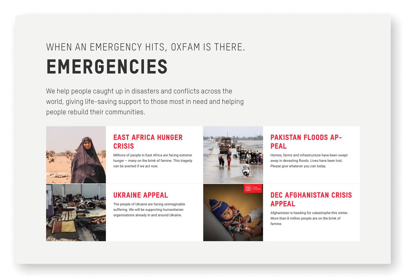
Simultaneous online campaigns: Oxfam
Story-telling strategy
You also need a story-telling strategy. Some donors are stimulated by success stories featuring people who have benefited from the treatment programmes or research activities funded by the charity. Other donors are triggered by sad stories – for example, about lives lost which could have been saved. What stories will drive supporters to your website and encourage them to give?
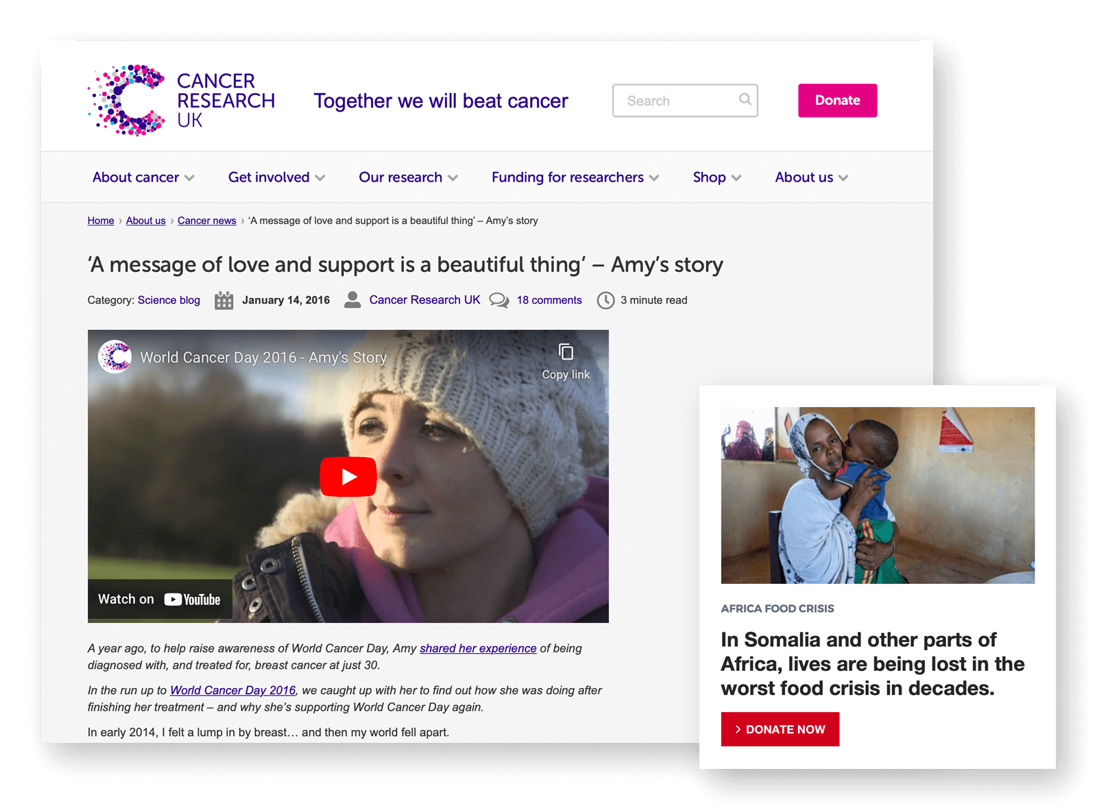
Success story: Cancer Research UK | Sad story: British Red Cross
2.1 Fix your operations
Team members: strategist & project manager
Customer Relationship Management (CRM)
Once you’ve adjusted your donation strategy, you need to check your operations behind the scenes are fit for purpose.
Do you want to build a community around your cause? If so, will you nurture it on social media or via email? How will you give donors an ongoing account of the outcomes of their support for your charity? Is your CRM platform running effectively to manage all your data?
A crucial operational requirement for any ambitious charity is a donation platform that integrates front-end marketing with a payment gateway, backend campaign management,, and donor profiling. There are many things to consider when choosing and managing a donation platform.
Donation platform considerations
- How simple is it to integrate the platform with your brand?
- How easily can you make updates?
- Does the platform have a feature for recurring giving?
- Is there a peer-to-peer fundraising option?
- How many payment options does your platform offer?
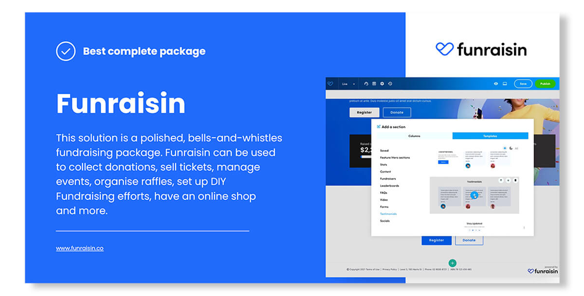
Our recommended donation platform
Download our donation platform comparison guide
There are many donation platforms on the fundraising market, each offering its own technical features at a different price. We chose seven platforms to review. We spoke to the specialists, trialled the tools and did the user research. The pros and cons of each platform are specified in the guide.
3. Audit your content
Team members: UX designer & content specialist & project manager
The third step of online donation optimisation is to analyse how your content performs across the user journeys you’ve modelled. This should help you build new user flows that better meet user needs.
Audit criteria
- How will potential donors find your donation landing pages?
- Does existing content meet user needs?
- Does content address the pain points in the user journey?
- Does content maximise user pleasure points?
- Does the content support your donation strategy?
- Is content reusable across CRM operations?
3.1 Optimise your content
Team members: UX designer & content specialist & project manager
Once you’ve identified your web content issues, you can begin to fix them. The first thing to do is to review best practice across the charity sector. Genius, as they say, is not afraid to steal. Optimise the content and design across your new user journeys. Pay particular attention to rewriting unclear copy, putting in place high-resolution imagery and providing clear signposts along the donor journey. Wherever you can, eliminate pain points and enhance moments of pleasure.
Check out our following top tips for donation funnel brilliance!
Messaging hierarchy
Motivate donors with a story before they get to the donation landing page and follow up with a campaign update.
Donation landing page design
Keep the page uncluttered with few opportunities to click away. Don’t be afraid to use a powerful lead image with minimal copy. Donors will want to be aware of where their money is going, so describe the concrete benefits of specific donation amounts.
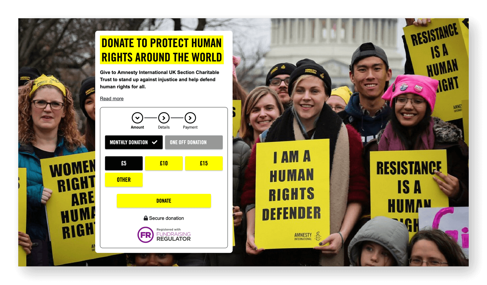
Concrete benefit: Amnesty International
Donors want to know that the largest part of their donation goes to supporting the cause rather than to running the charity. You can reassure them by being as transparent as possible.
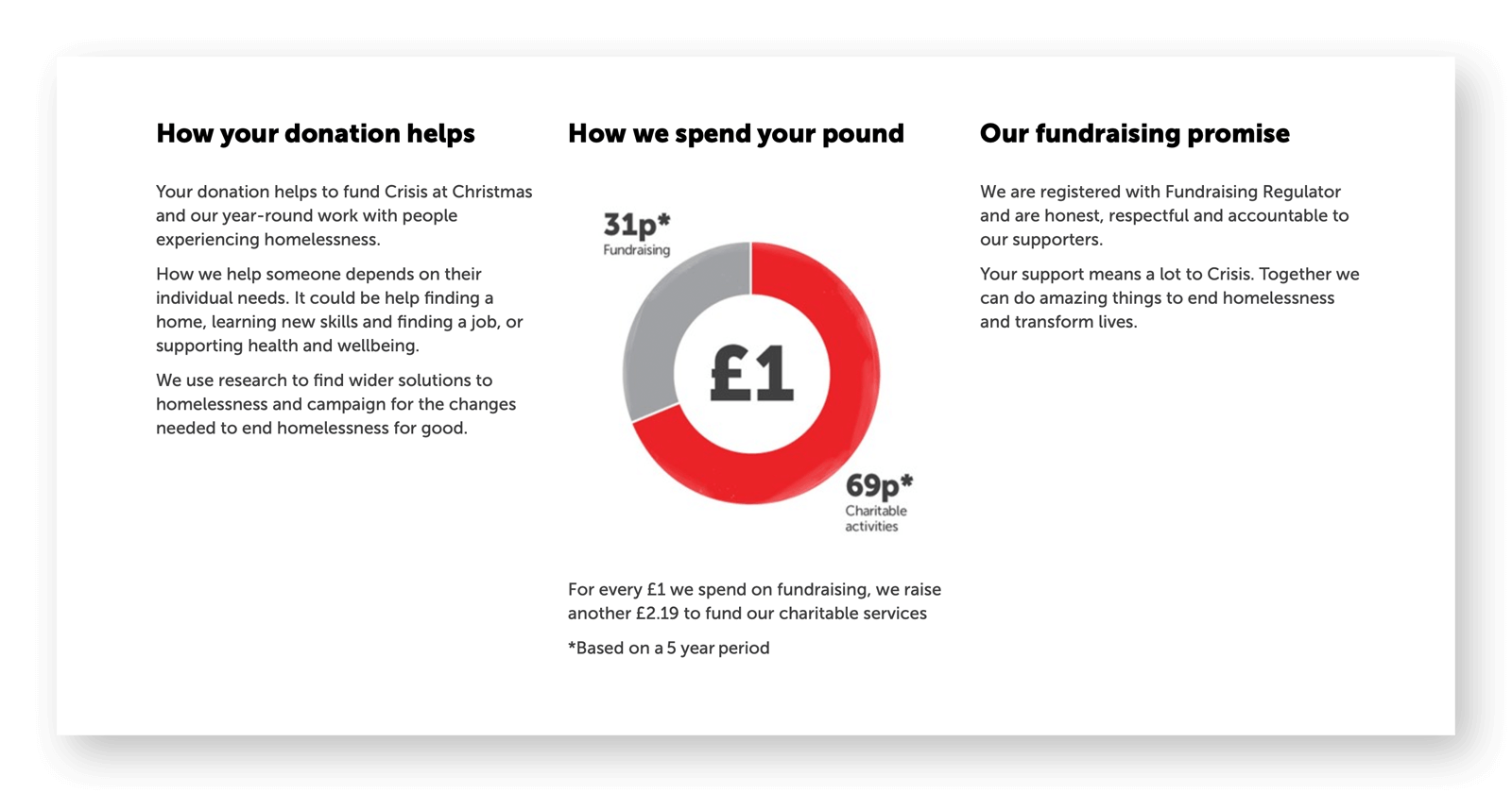
Donation transparency: Crisis
Donation prompts
Experiment with donation nudges. What’s the optimum amount to suggest? How can you encourage ongoing monthly donations over one-time donations?
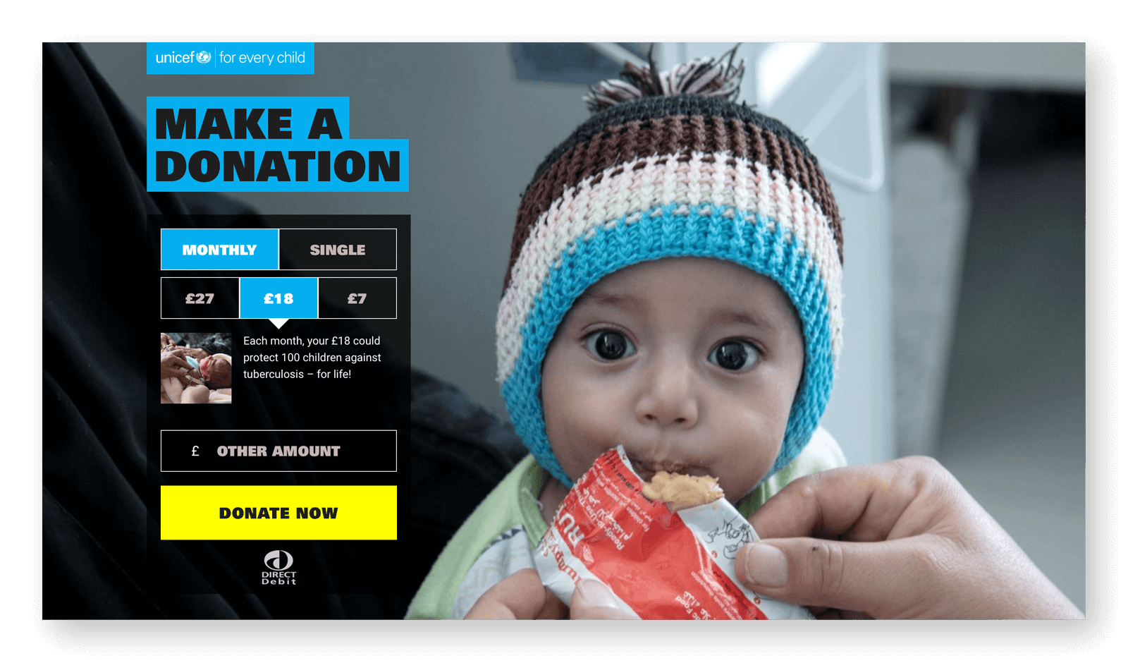 Colour-coded donation prompts: UNICEF

How we increased our value to the RSPCA by 71.5%
The UK’s leading animal welfare charity needed to increase the revenue generated from its existing supporters. Our web optimisation programme increased the value of the average donation by 8.79%. It also drove up the donation page conversion rate by 10.23%.
Information gathering
Don’t overwhelm first-time donors by asking for too much personal information all at once. Disclose information requests progressively and keep the number of form fields to a minimum.
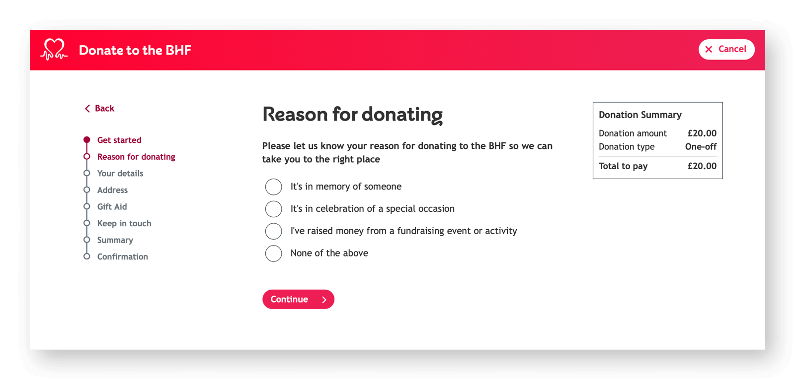 Progressive disclosure and minimal fields: British Heart Foundation
Legal copy
Include relevant legal copy (such as for Gift Aid declarations or marketing opt-ins) in a way that is not overwhelming. For example, break up the messaging into simple elements rather than using great blocks of text.
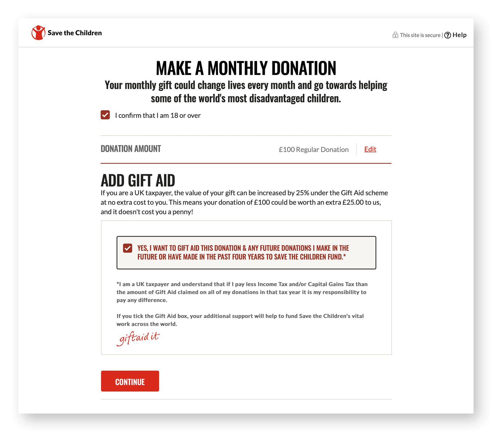 Gift Aid copy: Save the Children
Donation thank you message
Don’t forget it. A thank you page not only helps cement the relationship with the donor, it also presents an opportunity for further engagement. You could, for example, include a mailing-list sign-up, a campaign update, or even a survey.
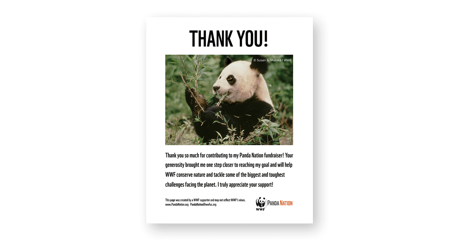
Thank you message: WWF fundraising toolkit
Impact reports
Keep the trust of your more altruistic donors with regular updates via email or social media. Case studies, testimonials, statistical data and field videos give donors the confidence that their contributions are making a positive impact. Make impact reports visually engaging with maps, graphs and timelines.
Social proof
Showcase the reasons why your donors are involved with your charity and the rewards it brings them. Compelling testimonials are excellent for highlighting the positive impact of charitable work.
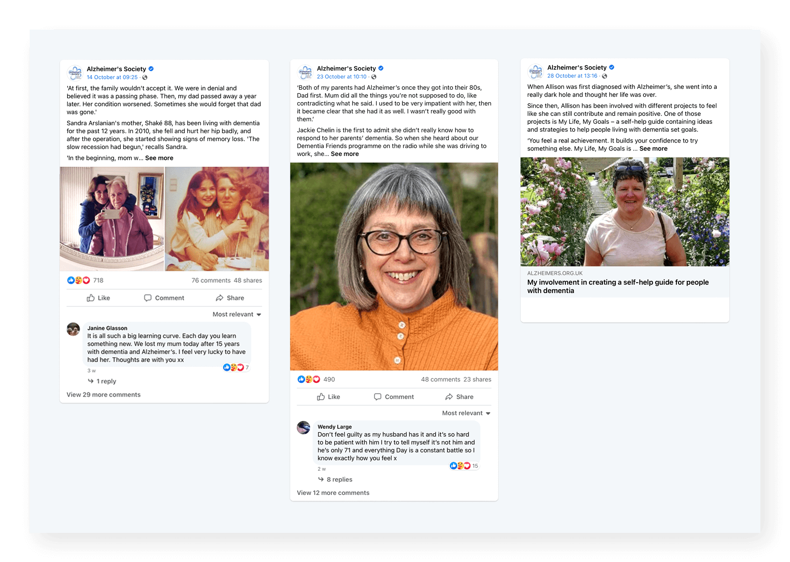 Fundraising testimonial: Alzheimer’s Research UK
Credentials
Are you part of any official bodies such as The Charity Commission? Adding credible logos and links to your website will increase donor trust.
Creds logo used by top charities
Accessible design
Ensure the web content in your donation journey meets at least WCAG 2.1 AA standard. This will not only make your content accessible to the 22% of the UK population who are disabled. It will lead to a positive experience for all your donors.
Find out how you can make giving addictive
4 Test, test and test again…
Team members: CRO strategist & project manager
You should be testing throughout the online donation optimisation process. User testing in the research phase will help you model the most effective donation journeys. And multi-variant testing in the content optimisation phase will help you gauge the impact of changes to stories, landing page designs and button copy.
Some optimisation tools even enable you to send traffic to the best-performing variant in real-time automatically. Testing your donation journeys across mobile and desktop will help pinpoint certain areas – for example, form fields or buttons – that are not readily viewable or usable.
Are you a charity looking to get more online donations? Let's talk it through.
Call us on 01903 285 900 or send us a quick message, and one of the team will get back to you.
Do you have a challenge we can help with?
Let's have a chat about it! Call us on 01903 337 580